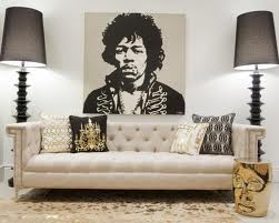
Stick with Possibilities and not just the Hope of what will happen.
Me-How attitude ;)
Your Design Expert

Your Custom Text Here
Stick with Possibilities and not just the Hope of what will happen.

Me-How attitude ;)

Your Design Expert
Yesterday I visited FAN expo Vancouver. Where the superhero's of our comics to TV to film congregated in a MEET UP. It was AWESOME to see so many people emerge in their Super Hero garb.

Vancouver Trade & Convention Center........
I wanted to share some photos of my adventure into a different world of Expressive Design. From many illustrators like the Walking Dead and new emerging artists, Comic's Galore, costumes and make up artists, dash of Steampunk, and the miles of walking, taking in the sights n sounds oh and of course the mini donuts were endless.
LEGO was on location with their own take on some of our hero's- and an interactive build wall. Cool.

Lord of the Rings on guard.

The Ninja Turtles, Superman.....and Batman in the mix too!

Need some garb......massive Tower of Shirts, Hats and more.

Trekkie's on ground. Taking in this earth like event.

R2D2 and the characters of Star Wars working the crowds. Feeling like a photo you could strike a pose for a donation to Heart n Stroke = priceless.

Cave women and child, walking T-Rex......a talking one taeboot!

Even Elvira needs to have a rest while waiting in autograph lines to meet her mentors.

Arr, the pirates were on location too.

Roman warriors........
Yes, Ghost-busters were on location keeping the event ghoul n' ghost safe. Need to try on a Buster pack back, you can!


If you about Vancouver this weekend definitely check it out. But if such an event should land on your door, dress appropriately and check it out.

Expert Designer on Location.

Today's Colour Story starts Down on the FARM.

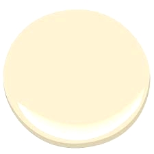
Inspired by new and the expecting of new, is WHOLESOME by General Paints. A colour that makes me think of baby chicks, soft and yellow. The new egg from the farm - organic textures and purity.

General Paints
The colour story is made up by looking at the colour number, with the W it defines a White Paint base colour. In addition, its had the pure hue YELLOW, and red. The saturation of this hue is light and bold. The mood is renew, spiritual, happy, comfort and soft glow.

The Yellow breakdown palette.
This week I visited with one of my nieces, who told me of her class project and the expecting of baby chicks hatching. How exciting! She burst with smiles telling me of the one chick who was stuck in the egg shell, and was too tired to pull his bum out. But maybe later, after it had a sleep - how precious! Then she continued to tour me through the class and show me the new baby chicks, that 'made it out'! They were a beautiful shade of yellow, fuzzy and not very well coordinated -stumping about under the heat lamp. Not quite sure of their steps yet. We laughed at them being so curious with each other, and us.

Wholesome is found in the yellow of Baby CHICKS.
As we celebrate Easter this weekend, gather with family and friends - lets look to the simplicity in life and each other. The foods, the Egg rituals from painting to hunts, take a moment to indulge in wholesome that makes us smile, and puts love in your heart. That sense of comfort and courage, and reflect on where it could take us anew on the journey ahead.
Hoppy Easter everyone,

Your Design Expert

Designer Easter Egg - whimsy!
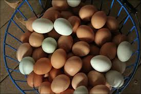
Farm Fresh Wholesome, eggs.
Is New Divine White by Dulux.

New Divine White -inspired by the ceilings of cathedrals.
Inspired by Good Friday, I looked for a colour that would inspire the mood of clarity, clean lines, light and peace. I found these in the colour, New Divine White by Dulux - No. 66YY 85/045
A colour that supports our colour journey this week of undertones.
The colour language of New Divine White, is neutral with pure hue of yellow and mass tints of white. A pure undertone from the white neutral palette.
This colour would be fantastic in the sheen levels of matte for a room with many natural lighted windows. However to use the New Divine White, with the sheen of satin or pearl would be stunning in a room with no or little natural light.
Look to create your own light with White chandeliers, inspired by Murano glass and crystal......

Its the balance of Light found in a traditional white glass/crystal chandelier.

The striking balance of a modern glass chandelier
Create rooms with New Divine White, or enhance a piece of cherished furniture for a new purpose.

In a modern Kitchen dining area, clean lines and clean uncluttered vision - clarity.

The bench. New White Divine - Seated.

New White Divine, used here in a restorative retreat of the bedroom. A soulful rest.

Your Interior Design Expert

New Divine White by Dulux, and the search for neutral balance and light.

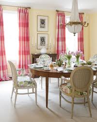
Today's Colour story is a double feature.......in an undertone of Yellow in Hepplewhite by Benjamin Moore and Yellow Submarine for TBT by General Paints. Both historic colours in their own palettes of time.
Hepplewhite by Benjamin Moore
No. HC - 36

Yellow Submarine by General Paints
NO. CL 1743M
The Colour Language in Hepplewhite is a nod to antiques, the true colour of the past an undertone of ivory. Hepplewhite is from the Historic Palette of Benjamin Moore Paints.

It is composed of pure YELLOW, tints of white, tones of black and undertones of green-blue. The saturation of this colour is dull, warm. Suitable for a room with south west exposure - giving a warm mood. Similar colour found in the glow of a candle. In a northern exposure room the mood would be a dull, colder mood - one perfect for layering decor and textures.
In the colour language of Yellow Submarine, by General Paints is also playing into Throw Back Thursday - a classic colour from another era evoking fun, loving, and happiness.

When we look at the number system of colour sometimes it will give us a clue to the colour recipe. Here the number contains the letter M - which refers to a medium white base for tinting. The colour is made up with a large part of pure YELLOW hue, tints of white, and pure red. This gives the saturation of light to bright, bold - a 'cheery' mood. One we see in the Beatles, YELLOW Submarine!
Here are a few inspirational 'Throwbacks' for Today.
Hepplewhite in a traditional design.

Hepplewhite in a modern room design.
Modern Yellow Submarine in decor of a lounge design room.
Modern workplace to inspire thoughts and go forward - Yellow Submarine.
As in colour allow it to speak to your surroundings, and to your era of design with Hepplewhite or Yellow Submarine.

Your Designer,

CREATE. Live. LOVE......the Colour Story is yours.

Ambition Destiny Passion Fate.......these are the drives that keep me alive in Design.
Focus Forward........Respond to the Moments.


It's Wisdom Wednesday, and as my Dad would say Wisdom is Power......the owl always listens. Last week I touched on the importance of calling in the experts when taking on a project and using their skills to improve your space. In Design one of the greatest assets we bring to the table is the power to listen, to hear our clients, to seek the conversation with the space and fulfill the function.
When planning your project you may seek out expertise of trades, and this should be coordinated by a General Contractor. This is what I would call the Team Lead in the trades, a person that understands all the roles of the team, able to question the trade and ensure that your project is being ran to plan efficiently. The person maybe a trade person too, and able to work along with the trades, mentor and inspire the project - that is an amazing lead. I have worked in such with such a trades person, under collaborative builds/reno with Green Craft Homes - Vancouver.
The General Contractor person plays a key role in coordinating the needs of your reno/build with the necessary trades. Trades may include, the carpentry, painter/mudding, electricians, tile setters, joiners, and of course the plumber. It will also include inspectors and the ability by the General Contractor and the team of trades to ensure permits are pulled and met at inspection levels.
Remember to be respectful to your trades and embrace there expertise - your reno/build will be enhanced in skill levels that way, setting the tone in creative passion. It should never be just another day to question.
The role of the Designer is also key in the trade team or in a solo consulting design role with the client.
When the Designer is working with a General Contractor, the role is not only for Design by also to liaison with the Clients and Trades. To ensure that Client has been given the best material and vendor selections in accordance to availability and budget, the design vision is maintained, and that the reno/build Design Plan is being followed. The Designer is that voice of not only the project but also the Client to the the trade team. The Designer maintains that voice in presence during the project conversation, through site visits, lead & mentor and being able to problem solve - this will complete and enhance a successful project.
In the role of consulting Designer, is now a guide expert and liaison for trades and Client. We are the General Contractor plus, plus, plus. We develop the complete Design Plan, source trades, materials & vendors, and maintain relationships throughout the reno/build. The Designer will use their expertise design skills and knowledge, and common sense to ensure that the project is completed efficiently while maintaining budget expectations.
Remember by consulting the expertise of a Designer, you will receive the highest standard of creativity,we ensure that the right materials are selected, give solutions and professionalism to your vision - we enhance the Design for YOU the Client.

Your Designer,

Pacific Mist by Dulux
No. 51YY 83/060
Is a fitting colour choice for today, as we look out into rainy west coast weather. Puddles and the spring greenery looking clean and revived......and the birds are loving it!
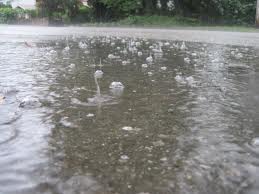
Vancouver Puddles, splish splash!
In our language of Colour Theory, its the breakdown of pure Yellow hue in a muted tone. Tints of white, and undertones of green showing its saturation a dull, light neutral tone.
Using this in paint form has its place in a matte sheen and also a satin sheen, working with natural and influenced light reflections.
The mood of Pacific Mist, is calm, comforting, and a feeling of personnel sanctuary - retreat full.
In our spaces I can see this used in everyday spaces as well as recreational or retreat-full rooms. Here is glimpse of how it may inspire you and YOUR space.

Pacific Mist is a cottage colour, a colour of white washed walls, -exterior.
White washed cottage walls -- interior.

Personal Retreats, a soak in the tub.

Pacific Mist, repainted vanity and upper wall.

a lounge in an everyday neutral setting...........imagine it as yours.

Happy Rainy Day......Pacific Mist Style!

Pacific Mist, Howe Sound - BC

Today's Colour Story is the continued journey of yellow neutrals, with Linen by Pratt & Lambert paints.

Linen By Pratt & Lambert
No. 12-1
This colour or hue is from the pure hue of YELLOW, plus red, tone and tints of white & black. Making this colour warm with an undertone that is dull. The saturation of the colour is light and mellow.
This colour could be used in a southern exposed room, that will give it brightness and warmth that will not be overwhelming. The same effect in a room with little natural light.

White Linen reminds me of the beach, feeling of relaxation and ease. Freedom
The colour inspires me to look at natural Linen in design from lamps to furniture. Its an organic textile with a lot of textile that works in a variety of room conversations. But most notably we are drawn to Linen and how it has given a new light to how we dress our bedroom - Linen. It has given us the forward thinking that our bedrooms are retreats of the general activities in the home and we enjoy designing them with soft linens, textiles and lighting. Here are some inspirations.......

The Hotel bed linen lines.......

Contemporary Bedroom and layered linens.

French Country Guest Room, layered linens.
We also look to lighting, and lamp shades have again expressed a new look with textured linen shades. In the colour similar to Linen by Pratt & Lambert and in deeper hues.

Organic texure of Linen
Printed shade in Linen
One of my favorite lines in contemporary lounges or great family rooms in the Linen Sofa - it will wear with ease and is a family friendly fabric,. It will clean well and not pile like some other fibers.

A wise choice for family wear n' tear found at IKEA, contemporary style, classic elegance -budget $$

Another fantastic choice, elegant yet traditional linen chesterfield style by Restoration Hardware, budget $$$
In completed rooms......
In a modern vintage room.

In a traditional room, with a nod to French Design.
Linen is also most familiar when visioning interior design in French Country or in today's form of Shabby Chic. Here are some inspiration photos that will look familiar and help you design a Linen space and compliment it with Linen walls.

Layered Linen Textiles.

The side chair, here an accent Rocker in Linen by Restoration Hardware.

A peek into French Country.

Remember to use these inspirations for Linen by Pratt & Lambert in your space in either wall or furniture. Tres Bonn!
Inspired by Design Focus on LIGHT, in Lighting my top three TASK Lamps are....

Armstrong by Urban Barn

Forsa by Ikea

Hangman by CB2
These Task Lamps are here not just my top three in FORM but also in Dollar Value.
The Armstrong by Urban Barn, gives that old world charm, vintage aesthetic and works in all design styles. But has the industrial vibe that is very West Coast style. Purchase for $189.00
The Forsa by Ikea is the classic task lamp, with reference to the pharmacy light. Great Look and fantastic price at $29.99
The next choice, is the Hangman by CB2 a modern twist and solid build. The lamp is constructed in oak wood and is the only LED I have chosen. I also love the RED button accent. Works also in a variety of design schemes.
Task in Style,


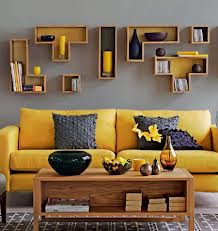
This week our colour story journey of Yellow will change and focus on the touches of yellow and tints of white. How there is many shades of yellow that we use in yellow and how it effects our mood in design.
Today's Colour Story starts this conversation with Polished Pearl by Behr Paints.

Polished Pearl by Behr
#PPU6-9
In our colour wheel, Polished Pearl is of Pure YELLOW, small hit of red, and massive tints of white. It is a warm yellow under-toned white. Allowing this mood to be open, serine with its bright, fresh saturation. Its not a stale white by any means! This Yellow White would work in a room with north and eastern natural light exposure. It will work to brighten a space with little natural light, adding brightness to the room and warmth.
Polished Pearl is inspired by Pearls, look at the reflection and colour variation in Yellow White pearls - very natural.
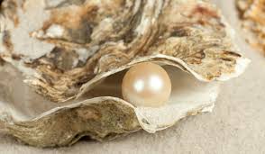
Natural Pearl

Polished Pearls in Yellow Tones
The mood this colour invokes is calm, open and serine........

Long Beach - BC

Open Mind Open Soul
This colour tone is perfect in many rooms where you want to enhance the space for light reflection and to create openness.
In Rooms such as.......
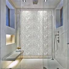
Bathrooms: Polished Pearl tile used as accent wall in shower.

Mother of Pearl used as accent wall with live edge vanity = Stunning Design.

Rampant Red Design & Green Craft Homes Build
Closeup of Custom Design Mantel - Mother of Pearl Inlay

Rampant Red Design - Green Craft Homes Build
Mother of Pearl Tile Inlay in Maple Wood Mantel

Kitchens: Pearl Mosaic tile used in kitchen back-splash.

Polished Pearl with white warm textures, and yellow wall.
This colour tone is perfect in many rooms where you want to layer whites for a contrasting effect using the same colour but with different textiles. In Textiles such as.......
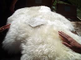
Sheep skin has that polished silk pearl white, with yellow undertones.
Close Up of the polished mother of pearl - Mosaic Tiles.

Pearl can be found in floral textures, white yellow spray and also in silkiness of pussy willows
Lighting is a great way to introduce this Yellow White to a space as well. Simply change up a lamp shade, white shade and spray paint the inside with a white yellow paint = this warm white glow when lite.

Introduce Polished Pearl with lacquered white lamps/lights. Modern and clean lines.

Inspire that yellow glow with yellow inner shades.
Of course in wallpaper the Pearlized Light reflection can be established in patterns........

Checker by Graham & Brown Wallpaper
Open Your Space with fresh inspired white, by reviving a piece of furniture, or accenting a wall, or adding a pearlized piece of decor, think Polished Pearl by Behr.


Goldilock's Choice

Purchase Mythic Paints from Greenworks Hardware Vancouver
Today's Colour Story is inspired by Mythic Paints with Goldilock's Choice.
Turn to the colour wheel to discover this pure YELLOW tone. It has a different formula with additions of green, and red undertones - allowing this hue to be darker. Goldilock's Choice saturation is still bright and fresh and is suitable for a western exposure room setting. Giving a warm comfortable mood. It will work well in a room with a large amount of windows, and enhance a room with little amounts too.

Goldilocks's Choose Wisely! :)
Design Inspiration can be found in the golden tones of this colour, as in the honey over the porraiage oats she had for breakfast.

Honey n'
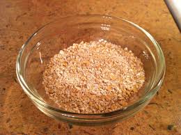
Oats!
Table dressing is an inventive way to introduce this hue to your home. From linen, candles, florals, and dishes. This is some inspiration to bring Goldilock's to style your table.....
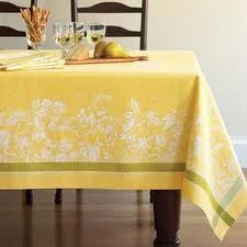
Dress with table cloth and napkins.
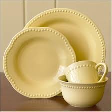
Yellow Dishes, not to beige as they will look dirty in the yellow layering mix of accents.

Yellow Glassware - vintage Saturday shopping finds.

The finishing florals, add a spray of pussy willow.

The Pillar Candle- use a beeswax candle.
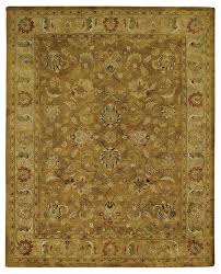
The perfect way to complete your table dressing, is to have it anchored in the space with an area rug. These rugs both compliment the yellow and the darker undertones of Goldilock's Choice.
Hey, Have a fantastic weekend!

Goldi and Her Gang! Cheers ;)

Tune back on Monday where our journey through Today's Colour Story continues.

Today's mission is to explore with purpose - sunshine- and of course OUTDOOR MARKETS!


Cheers!
LEARNING! To Tread through the Trends.....

I usually do not use TRENDS in my designs, I think its a healthy balance to know what the current designs are expressing - but to BE mindful of the balance between trends and everyday living aka elegance. Your space will not only be unique it will not date.
Remember we don't all live in a Design Mag, we live in REAL time and space. So strike the balance!
This month as we journey through the YELLOW's I want to note that YELLOW is actually a very HOT trend interior design colour in this moment!. You will notice that it generally is around April & May as we celebrate the regrowth of the season, its that feeling of being alive and seeing ourselves and spaces in a new LIGHT.
So indulge in YELLOW, celebrate it.....and moderately add it to your space in things you LOVE not just because it the trend.
Happy Friday Design Followers.........

PS - looking for some more inspiration photos on TRENDING.....visit my Facebook Page today!


are your Searching.........Designer space Dreaming........
I am currently accepting proposals for new projects and design ventures. Please forward me your ideas, dreams - in working together I can establish a plan that brings you the Interior Design space you dreamed of into reality.
Please contact me directly to discuss project and applicable fees.
Have a wonderful weekend.


HAPPY .......

General Paints No: CL1673M

Vintage Fender Guitar
Today's Colour story is inspired by the break in conversation, RIFT by General Paints.
Colour Makeup of RIFT is from pure YELLOW, pure red, and tints of white. In saturation this is a bright, bold HOT colour. The mood can be contradicting setting contentment and yet as diverse as a road trip.
The word Rift is a complex in meaning, from an opening made by splitting - a break, a break in friendly relations or difference of opinion. In reading the meaning I then look at how this colour changes the mood of when I first looked at it, being a colour of contentment- lost in fields of wheat illuminated by the sun. Dreamy and content. However now I expand my mood to include a break in space, engaging into another room a different conversation.

:Sculpture: Lego Man By Nathan Sawaya
In Interior Design I would start that break in space with the conversation by introducing something of a large scale that doesn't necessary belong but adds interest. Possibility with art, in a light fixture or in wallpaper.

Oversized Glass Octopus Chandeler.

Baroque by Graham & Brown
Bold Wallpaper that also can be a divider in wall conversation.

Oversized Floor Task Light

Girl in the YELLOW Dress by Tiffany Mathews
Forgotten Room Studios
I also relate RIFT to music, the break when a musician introduces their opinion. So as you gather with family and friends on Friday evening, solving the worlds problems of this week, breaking conversations with your RIFT. Keep the background alive with various musical rifts, enjoy the moments that allow us to reflect on LIFE.

ROCK out YOUR Friday!


I am attending a funeral again today, and I am reminded once again that life is truly short. So LIVE your passions, Love those around you and I believe your life journey will be enriched and your Legacy worth while.
keeping Design Real,


Today's Colour Story is taken a nod to Throwback in Rubber Duck by General Paints.

No. CL 1745D
The colour breakdown is Pure YELLOW, and red hue. Its saturation is bright and bold! Giving Rubber Duck golden undertones with a hint of both white and black. This is a high intense hue, very lively and fresh. The mood is of course Happiness! I can see YOU smiling :) from looking at it!

With the name Rubber Duck, I immediately think Bathrooms! Not necessary painting the whole room out, but a balance of the yellow and white.....or black! Inject this hue simply in linen, shower curtains and accessories. Fill a large glass urn with bright yellow soaps! Here is some inspiration.....and when stacking decor towels try adding a bold ribbon to hold them together on a countertop, or stack in a floor basket. Tap into your creativity.

Layer the bright colour of Rubber Duck in modern prints.

Stack your towels, and tie up with a ribbon on display.
Have an old chair that needs a facelift? Rubber Duck is the perfect colour for that entry chair, lounge chair on the porch.....or that seat in your bathroom powder area.

Add the colour to your space with Decor Accents or Kitchen Accessories!

1. Vases 2. Lamps 3. Espresso Machine
Create your own design accessories, try painting out a few vintage photo frames in Rubber Duck. Keep the frames empty and arrange on a wall or backdrop of a table. Want to fill in the frames? Frame your favorite textiles or wallpaper samples. A small project with BIG DUCKY impact.

Vintage Frames, Rubber Duck Yellow

But always, have fun with colour! Cheers,

Wednesday Wisdom
There is so much to consider when renovating your space, it usually starts with the thoughts of I need a change or this space just isn't working anymore, lets tear out a wall! Right!
So then we all have this feeling of empowerment and embracing the change with excitement, hit the local box store and start 'getting what we need'. Followed by opinion shopping online and with family and friends. Then the next step.....tackle the project. The next step is followed by total frustration and overwhelming thoughts of ' WHY' am I doing this again. Right.......
My designer instincts tell me that POWER to YOU! You have embraced change - but don't take on the menu before you order from the chef! I pride myself in being able to tackle a lot of home improvement projects and know when to call in for help and seek advice. This is ok, don't we all seek advice, get an opinion to make ourselves run better or function more efficiently, and we do this without hesitation. Our doctor, lawyer, butcher, we all have roles and we seek them for advice.So never hesitate to call your Designer or trades people.

Design Menu
So here is some FREE advice for WISDOM Wednesday.
If you are planning on a small home renovation(one or two rooms), that could entail one or all of the following: painting , flooring, lighting. Start compiling your thoughts and designs in a notebook, do this over two weeks. You will see how your opinions change and grow. Then go to a big box store and you will have a better understanding on what you need to select based on what you have compiled, what you are drawn to. Confirm this project information with a Design Consultant. Or seek advice from the many knowledgeable staff members, and you will make concise affirmative decisions, and feel empowered to finish your project. Your efforts will be awarded with wise choices and top drawer work at the end.
However if you are planning a large renovation, which consists of the above in more than one room, or a large part of your home. I would recommend contacting a designer. A designer will walk you through the space, ask questions on function, mood and harmony. From this conversation the designer can advise on removing walls, re-configuring the space that may include lighting options and traffic patterns. The designer will return with a design plan as you work together to achieve this project, and if needed will recommend or source a trade team to take the plan to the next level.

Design Plan
What makes up a Trade Team? Well its a combination of experts that you draw on for their knowledge and skill that will complete the renovation. This would include a General Contractor, possibly a draftsman, carpenter, electrical, plumbing, painter, drywaller, and tile setter.

Build Team
Remember my line about the menu selection and cook? Well a well organized skilled renovation is completed when a team uses its knowledge and resources together. The chef has the vision, there is someone who serves the meal, and there are many prep cooks that pull the skills together to complete it.
And remember when you go to a restaurant, you trust that team with your order. The same respect should be given to your Designer and Trade team as in this way your expectations will be truly satisfied.
The other tip I would always say, is that it is better to seek advice in the beginning than to try to work through problems that could have been alleviated. Never hesitate to contact YOUR Designer or Trades we work with YOU. That's money well spent, Rightt?

General Contractor - Architect- Designer - Trades = TEAM
Our conversation will continue next Wisdom Wednesday by the trades and roles that make up these teams.
Respectfully -


Today's Colour Story shows a different side of Yellow......the muted side in

No. 12-9
Ale by Pratt & Lambert
Looking at our colour wheel, we can see that ALE is from the pure hue Yellow, with pure red, and green. It has undertones of black, this makes is saturation value dark and deep.
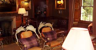
The mood of Ale is on the side of exotic yellows but also strong, with a slight warmth to it depending on how lighting was used. When traveling last time in Edinburgh I stayed at Prestonfield House - a most exotic interior design experience by far. I fell in love with not only the setting but the execution of how each room and space was designed - truly stunning! Please have a look and you will see how Ale was used in the many tones and textiles of the Yellow Room at www.prestonfield.com

Prestonfield House - Yellow Room
Edinburgh, Scotland
In a room setting I would use it as a re-treatfull colour in lounge/den. But of course it would also be with used in a tasting room or home spirit bar. Typical ALe -house!
Prestonfield House - Whisky Room
Edinburgh, Scotland
I know that yellow like any other colour can be a hard commitment to walls, so try to inject it into your space through textiles, furniture and accents. Here are a few ALE hues found from Furniture, revive an old piece or check out some reclaimed options at a local store. In Vancouver check out my favorite shabby chic designer treat of a store, the Passionate Home. Even adding Ale coloured glass or porcelain hardware to a 'normal' set of drawers or cabinetry makes a statement.

Yellow Porcelain Knob

Shabby Chic Dresser- endless possibilities!
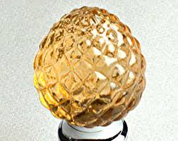
Crystal Pineapple Knob

Cabinet by Target- dress it with your own hardware.
Thinking Lighting? I continually hunt for organic and sculptural lights, and know that the colour Ale can be easily applied in glass variations.
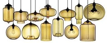
Glass Orb Pednant Lighting
As you ponder next time over your ALE choice in either paint or spirit - dissect its hue and light saturation.

Ale, wheat yellow undertones = Delish!
As always........Cheers!
